AI-Powered Experiences made for Trust, Control, and Adoption
Foureyes is an automotive data platform that helps car dealerships maximize marketing ROI and convert more leads. The platform's core value proposition has always been data: hard, reliable, trustworthy data. Users came to Foureyes because they could trust what they saw.
When AI entered the product suite, that trust became the central design challenge.

Lead Product Designer
sole designer on this workstream
Foureyes Inc.
Automotive Tech
Company size
100 Employees
Timeline
2023 - 2024
41% increase in AI feature adoption
Challenge
Starting in 2023, AI capabilities began powering core features across the Foureyes platform, from call summary generation to the PE+ sales assistant that automated outreach to thousands of leads. Technically, the models performed well. But adoption told a different story.
Users weren't engaging with AI features the way the product team expected. Power users, the dealership managers and sales leads who drove retention, were the most resistant. They'd override recommendations without reading them, ignore AI-generated summaries, or disengage from features entirely after a few sessions.
The product team's initial read was that this was a messaging problem. If we explained the AI better in onboarding, adoption would follow.
I believed it was also a design problem. And I needed data to prove it.
Research
I ran a four-method research effort to diagnose what was actually happening:
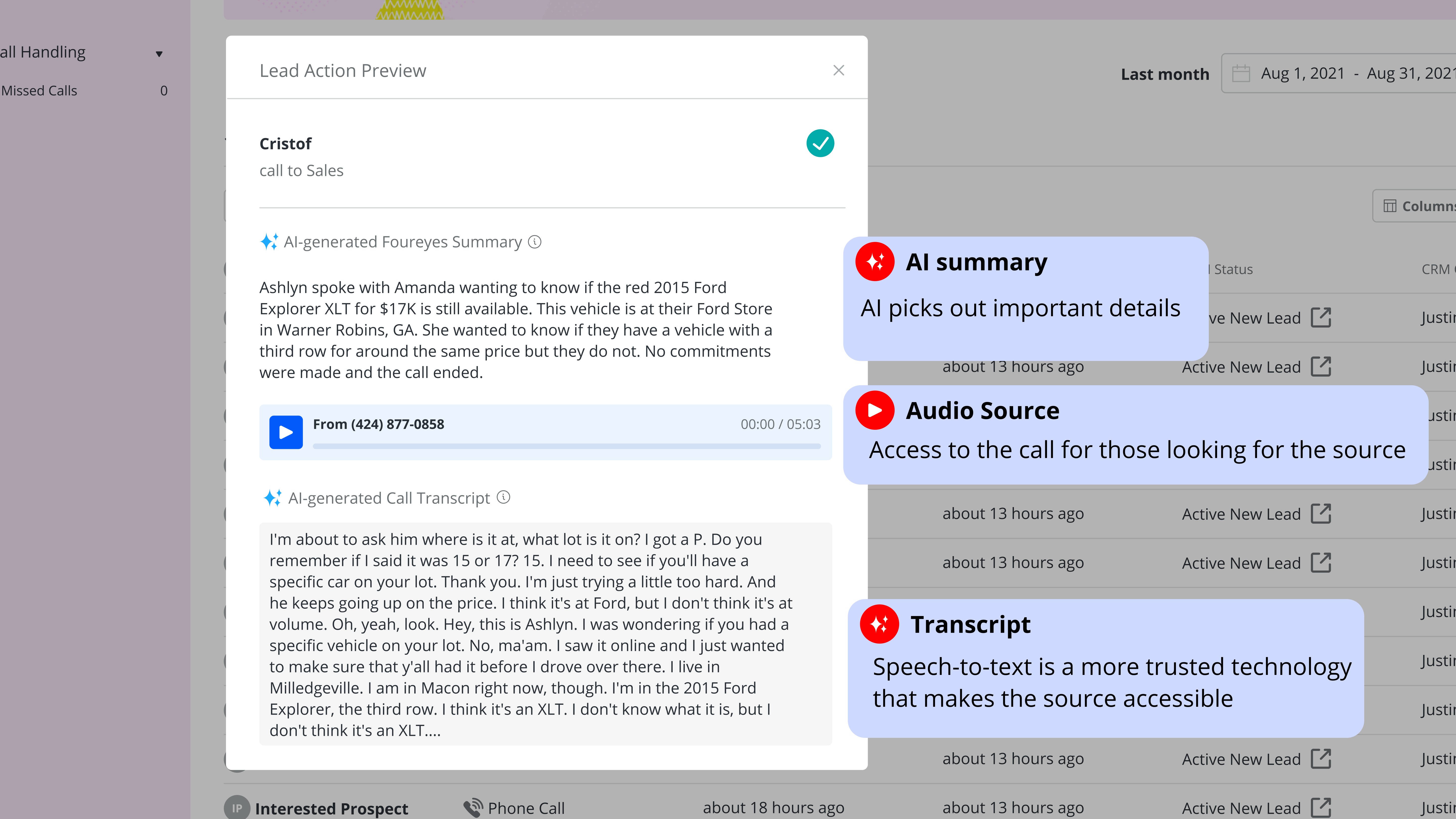
User interviews with 8 dealership power users surfaced a consistent pattern: They distrusted AI because they couldn't see why it did what it did. One sales manager put it directly: "I don't know if I can trust a number I can't trace back to something real."
Behavioral analytics via Fullstory and Heap confirmed the pattern at scale. Users who engaged with AI features in the first two weeks had dramatically lower retention than users who engaged with data features. Heatmaps showed high hesitation and exit rates at exactly the points where AI recommendations appeared.
Usability testing with 10 participants revealed a specific failure: users couldn't distinguish between hard platform data and AI-generated interpretations of that data. When they realized a summary or recommendation was AI-generated, often mid-task, their trust in the surrounding data dropped too.
Stakeholder interviews with sales and CSM leadership revealed a competing hypothesis: the trust problem was a marketing problem, not a design problem. The belief was that if users understood the AI's track record, they'd adopt it. There was also a specific concern that showing users how the AI worked, its inputs, its confidence level, its limitations, would scare them away rather than reassure them.
This set up a direct tension to navigate: my research pointed toward transparency, and stakeholders were worried transparency would backfire.
The Tension
The stakeholder concern wasn't unreasonable. There's a real risk showing uncertainty signals. "The AI is 74% confident in this recommendation", causes users to discount everything the AI produces. It's the same reason weather apps don't lead with margin of error.
But my usability data told a different story. The users who abandoned AI features weren't scared off by complexity. They were scared off by opacity. They wanted to know why. The question was how to be transparent without creating cognitive alert.
I brought the research back to stakeholders with a specific proposal: let me prototype two versions: one that hides AI rationale, one that surfaces it, and test them with real users. The data would decide.
The results: Users shown the transparent version not only adopted recommendations at a higher rate, they actually asked for more explanation than we'd provided. The hidden version performed worse on every metric, including trust.
Design Strategy
With stakeholder alignment secured, I defined a three-part design strategy to a single north star: trust is earned through transparency.
1. Distinguish Sources from Summaries
The first and most foundational problem was visual: users couldn't tell what was real data and what was AI interpretation. I designed a clear visual language to separate the two.
Hard platform data: records, activity logs, behavioral signals, maintained the existing Foureyes visual system. AI-generated content: call summaries, outreach recommendations, pattern analysis, received a distinct visual treatment: a dedicated container, an explicit AI label, and a confidence indicator showing how certain the model was in its output.
The confidence indicator wasn't a percentage. Testing showed that numerical confidence scores created more anxiety than clarity. Instead I designed a three-state system: high confidence (model has strong signal), moderate confidence (recommend review before acting), and low confidence (AI flagging uncertainty, human judgment recommended). Each state had a distinct visual treatment and a plain-language explanation of what it meant.
Design the 3-Actor Conversation
PE+ introduced a dynamic that required its own design system: conversations that involved three actors: the customer, the car dealership, and the AI agent simultaneously.
Early in development, there was internal discussion about whether to obscure the AI's involvement, to let the AI and the dealer appear as a seamless single voice to the customer. I pushed back on this direction strongly, and not just for ethical reasons. My research showed that customers who discovered mid-conversation that they'd been talking to an AI without knowing it felt deceived, and that feeling transferred to the dealership's brand, not just the product.
The design decision: make AI involvement unambiguous to all parties at all times. The conversation UI clearly labels when the AI agent is active, when the dealer has taken over, and when a message was AI-drafted but dealer-approved. Each actor has a distinct visual identity in the thread.
This decision transformed PE+ from an AI that pretended to be human into an AI that augmented human connection, a distinction that turned out to matter enormously to both dealers and customers.

Adjustable Control Panel with Progressive Disclosure
User testing surfaced a finding that pushed the design further than originally scoped: users wanted significantly more control over AI behavior than we'd anticipated. They didn't just want to see why the AI made a recommendation — they wanted to tune it.
I designed a layered control system:
Global strategy preferences : set once, apply across all AI features. Allows users to define their priorities (prioritize high-intent leads vs. volume of outreach).
Per-instance overrides : inline controls on individual recommendations letting users adjust or dismiss without leaving the workflow.
Undo/redo history : a lightweight action log showing what the AI had done and allowing one-click reversal.
For newer or less technical users, the default view showed simplified controls. An "advanced settings" path, progressive disclosure, unlocked the full parameter set for power users without cluttering the primary interface.
What Shipped vs. What I'd Do Differently
I'd invest more in the onboarding to the transparency features themselves. We assumed the UI was self-explanatory. Post-launch analytics showed that a meaningful portion of users never discovered the advanced control panel. The features existed, but the path to them wasn't clear enough.
Conclusion
The year brought many lessons when it came to designing AI-powered features. New accessibility considerations, considerations of transparency and clarity, and defining the narrative of AI involvement and value are all a part I carry forward in my process now.
It materially affected key SaaS metrics:
Adoption of AI recommendations increased by 41% within 8 weeks of launch
User modifications of AI parameters increased by 59%, signaling confidence
Time-to-task completion decreased by 23%, directly affecting daily operational efficiency
Feature engagement heatmaps showed reductions in hesitation and exit points
Sales and support teams reported fewer objections rooted in mistrust, and product analytics showed higher retention among users who engaged with the transparent UI layer compared to those who didn’t.
What This Project Taught Me
Designing for AI isn't primarily a visual design problem. It's a relationship design problem. Users need to develop a working model of what the AI does, what it doesn't know, and where their judgment is still needed. The designer's job is to build the interface layer that makes that relationship legible, not to hide the AI's limitations, but to make them navigable.
The stakeholder debate at the start of this project, "will transparency scare users away?" is a question every team building AI products will face. The answer, in my experience, is that opacity is what scares users away. Transparency, designed well, is what earns the trust that makes adoption possible.