Product Design
AI-Powered Experiences

View Case Study

YEAR
ROLE
Company
Two months into its launch, Foureyes PE+ was onboarding new users every week. The users were car dealerships who were using the AI-powered tool to reach out to thousands of sales leads in the time it would have taken to contact 100.

But there was a problem.
AI was sending out too many messages to people who did not want them. Dealerships who had just started using the tool began calling Foureyes Customer Success Managers (CSMs) in droves, asking to suppress the amount of messages going out.
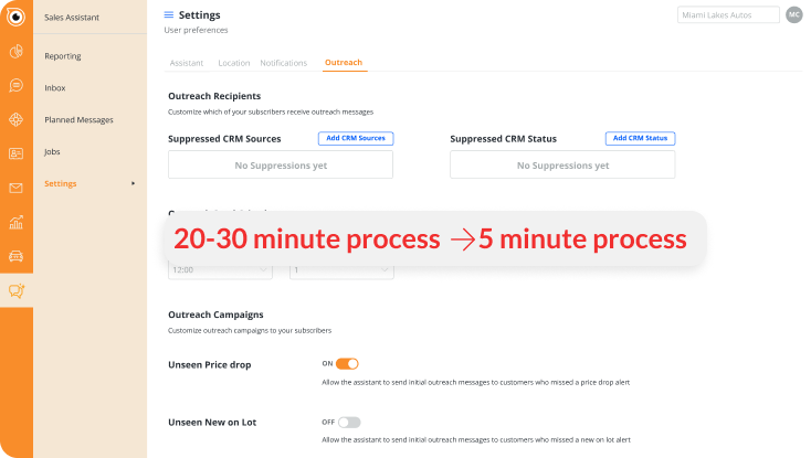
At launch, suppressing messages took 30 minutes per dealership. The process was frustrating and repetitive, requiring support staff to suppress the same list of people from several messaging lists.
Every minute that they were not suppressed, messages would continue to send and car dealerships would lose more leads. Because of this, the issue was escalated and we needed to solve it ASAP.
My goal was to clean up the process, make it simple, and easy. As a result, I got the process down to 5 minutes, reducing the workload by more than 80%.
From start to finish, it took 1 week to release a fix. Immediately, I began investigating the issue, which involved...
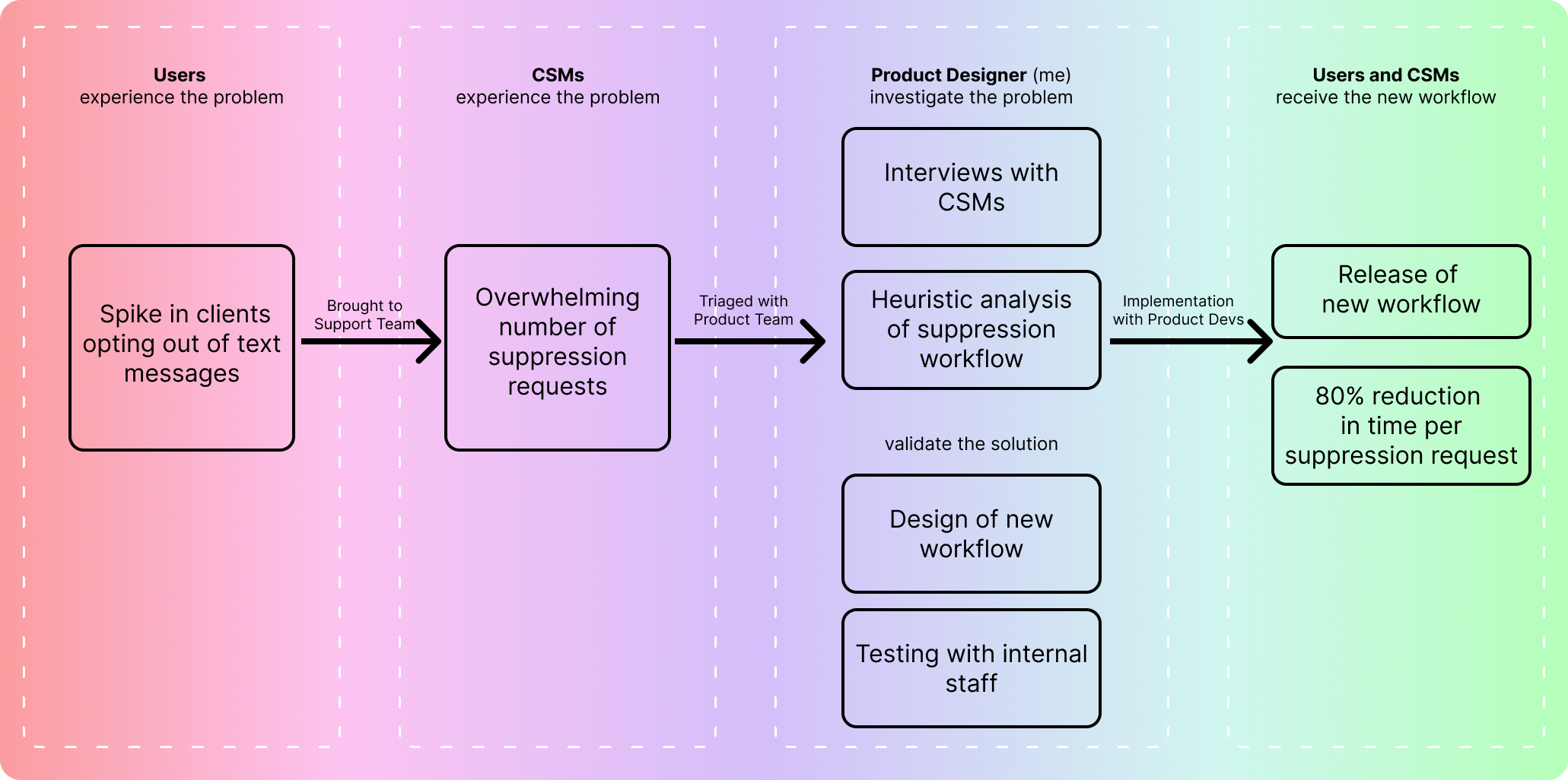
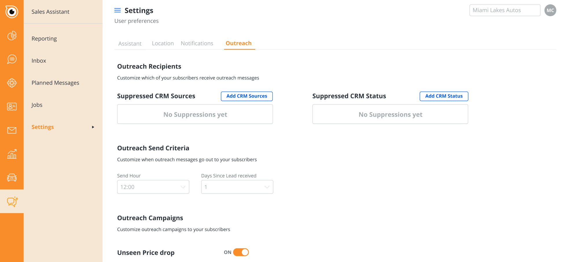
It was easy to find the root of the issue. After talking with several CSMs, they all pointed to the same thing: the settings page was a mess.
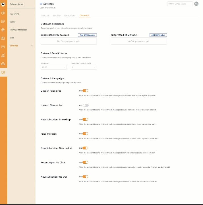
Before the escalation, the settings page was a dumping ground for all settings added to PE+. As more features were added, they were left unorganized and the focus of the page began to blur.
At this point, I started a heuristic analysis of the settings page. I found 5 critical issues that were causing message suppression to take so long.

From my investigation, it was clear that it took so long to suppress messages because the settings menu was chaotic. The options in the settings menu were disorganized, and it was too difficult to search for people to add to the exclusions list.
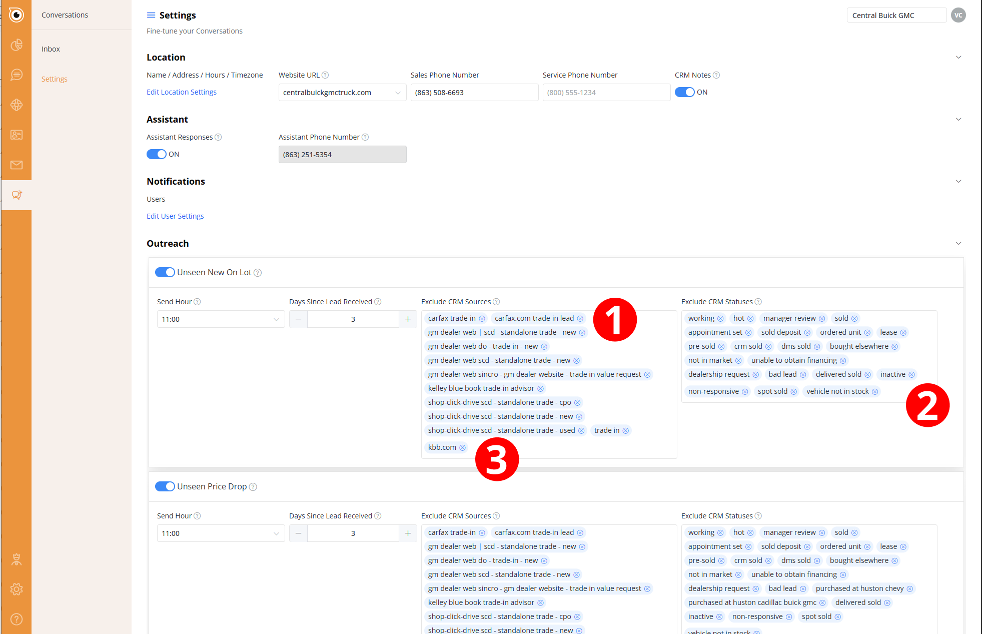
My solution overhauled the settings page. I made 3 major changes:
When I presented this solution to the CSM team and had them try it out, the feedback was simple:
"Hell yeah. Ship it now." -Seth, Manager of Customer Success team
With the CSM team's emphatic support of the new design, I worked with the Product Developers to get the new settings page live within the week.
The time to suppress outreach for an account went from a frustrating
30 minutes to only 5 minutes.
The Customer Success team was very excited about these changes. This project proved to be a great opportunity for them to feel heard by the product team and the quick turn around meant that we eased an immediate thorn in their workflow.